Daily Use Difference: Responsive vs Adaptive Websites
When building a website, it’s essential to understand the difference between responsive and adaptive design. These two approaches to web development dictate how your site will appear and function on various devices, from desktops to mobile phones.
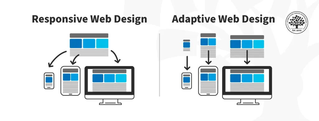
Responsive Websites: A Flexible Approach
A responsive website adjusts fluidly to the user's screen size. The layout remains mostly the same, but elements resize and reposition dynamically to fit the available space. This approach uses flexible grids and media queries to ensure a consistent experience across devices.
Example: Think of water in a glass—it takes the shape of its container but remains the same liquid.
Adaptive Websites: Tailored for Devices
An adaptive website, on the other hand, employs distinct templates for different screen sizes. When viewed on a mobile phone versus a desktop, an adaptive site might look completely different or have unique elements tailored specifically for each device. This makes it an excellent choice for creating mobile-friendly designs.
Which Should You Choose?
Both responsive and adaptive designs have their place in web development. Responsive sites are simpler to maintain and offer a more unified experience, while adaptive sites can provide customized solutions for specific devices. Your choice should depend on your target audience and the complexity of your project.
Pro Tip: If your audience primarily uses mobile devices, consider adaptive design for a tailored experience.